Tailored Air
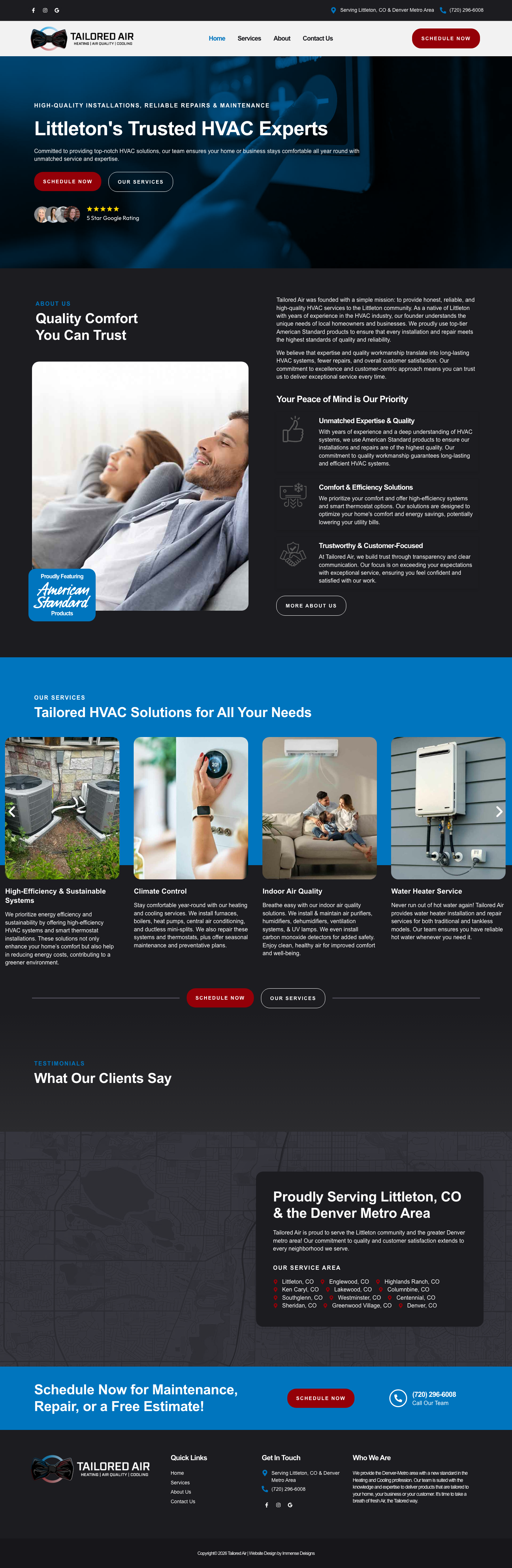

Most HVAC websites look the same: blue and white, stock photos of smiling technicians, a phone number, and a generic contact form. Tailored Air wanted something different. The target audience is higher-end homeowners in Littleton and the Denver metro who care about quality, efficiency, and the company they're letting into their home. The site needed to reflect that. Not flashy, but refined. The kind of first impression that filters out price shoppers and attracts customers who value craftsmanship.
We started with logo assistance to make sure the mark worked before building around it. The Tailored Air logo uses a clean airflow icon that reads as modern and intentional, not clip-art. From there, we designed a 4-page site on a dark charcoal palette with red accents and blue hero overlays. The dark background is an unusual choice for HVAC, and that's the point. It immediately separates Tailored Air from every blue-and-white competitor in the Denver market and signals a higher standard of service. The homepage leads with "Littleton's Trusted HVAC Experts," a Google Reviews badge for instant credibility, and value pillars (customer comfort, efficiency, quality) before presenting services in a card grid with real photography. The services page is comprehensive without being overwhelming: climate control, indoor air quality, water heating, commercial HVAC, smart thermostats, emergency services, and sustainability, each with a zigzag layout that pairs descriptions with real imagery. The about page uses a Denver skyline silhouette and a subtle concentric circle pattern that adds visual texture without competing with the content.
Tailored Air has a site that does what most HVAC companies' sites don't: it communicates taste. The dark palette, the refined typography, the real photography, the restrained use of red as an accent all compound into a first impression that matches the premium service the company delivers. A homeowner in an $800k house in Littleton isn't choosing the cheapest HVAC company. They're choosing the one that looks like they'll respect the home. This site makes that case before the first phone call.
“He was kind enough to listen to my ideas for revisions and humble enough to carry them out. That's the kind of guy you want in your corner when your desire is to produce a custom website that explains who you are and what your vision is.”
Dark charcoal palette with red accents deliberately breaks from the blue-and-white HVAC standard, positioning Tailored Air as a premium service provider
Logo assistance included to ensure the mark matched the refined design direction before building around it
Services page covers seven HVAC categories in zigzag layouts with real photography, comprehensive enough for SEO without overwhelming the visitor
Denver skyline silhouette and concentric circle pattern as subtle brand textures that add polish without competing with content
Google Reviews badge on the homepage puts third-party credibility in front of the visitor immediately