Immortal Mycelium
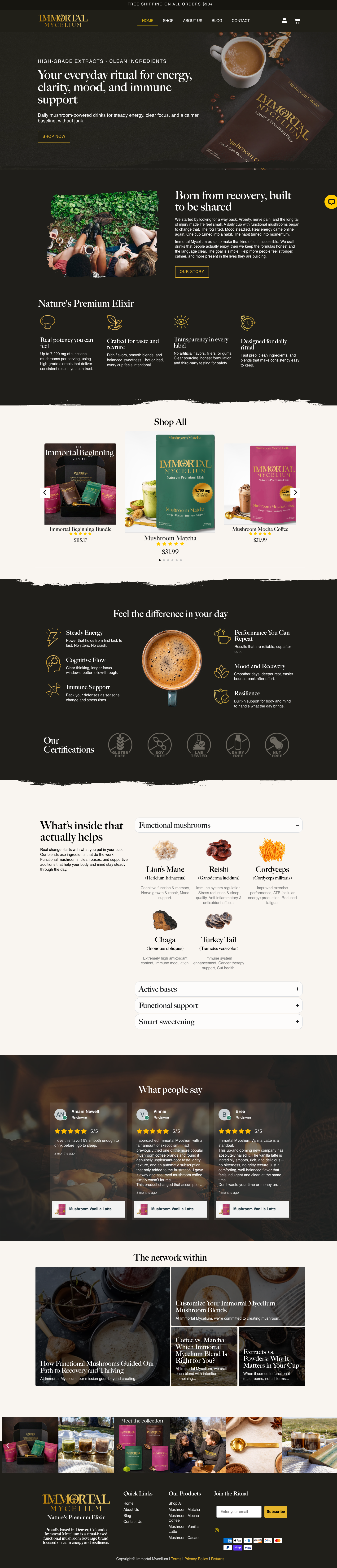

Chad and Mercy were launching Immortal Mycelium from scratch, a functional mushroom beverage brand positioning at the premium end of a crowded supplement market. Most competitors default to clinical white labels, vague ingredient claims, and earthy products that taste like exactly what they are. Immortal Mycelium's product is genuinely different: higher mushroom concentrations per serving, premium added ingredients, real organic arabica coffee, and flavors people actually want to drink. The challenge was building a brand from nothing that communicated that quality at a glance, looked like it belonged on a specialty food shelf, and supported a full e-commerce launch with products, payments, and shipping ready to go.
The logo carries the entire strategy. "IMMORTAL" set in a high-contrast display serif, with the O replaced by an ankh: the Egyptian glyph for eternal life, the literal meaning of the brand name. You can't read the word without seeing the symbol. Four pouches, four flavor-coded colors. Forest green for Matcha, deep brown for Cacao, magenta for Vanilla Latte and Mocha Coffee. Gold IM logo on every unit. The palette walks away from the clinical white and athletic black that dominate the supplement shelf and reads as a specialty food brand. We ran the full print pipeline: dielines, CMYK files, recyclable pouch sourcing. The WooCommerce store launched with six products, Stripe checkout, shipping, a chatbot, and a "Join the Ritual" newsletter opt-in. A custom graphics suite did the selling work most supplement brands bury in fine print: a milligram comparison against competitors (3,000-7,000mg vs. 250-2,000mg), per-flavor ingredient callouts, a "Feel the Difference" series, a four-step brewing guide, and a lab quality badge.
Immortal Mycelium launched with a brand that holds up at every touchpoint, from the logo to the pouch in someone's hand to the product page on the site. The color-coded packaging makes the four-SKU line readable as a collection at a glance. The comparison graphic does the selling work that most supplement brands bury in small-print ingredient panels. The WooCommerce store is live and taking orders. Eight months from first conversation to launch, with the product on the market.
Logo mark features an ankh replacing the O in IMMORTAL. The ancient symbol of eternal life woven directly into the wordmark, not applied as decoration
Four color-coded pouches (Matcha, Cacao, Vanilla Latte, Mocha Coffee) designed to read as a premium specialty food collection rather than a supplement line
Full print production pipeline: dielines, CMYK-ready files, and vendor coordination for recyclable pouch sourcing
Custom e-commerce graphics suite built for the site: competitor comparison, per-flavor ingredient callouts, "Feel the Difference" series, brewing guide, lab quality badge
WooCommerce store with Stripe payments, shipping setup, chatbot, and newsletter integration. Everything needed to go from brand to open for business