Emergency Mini-Treats
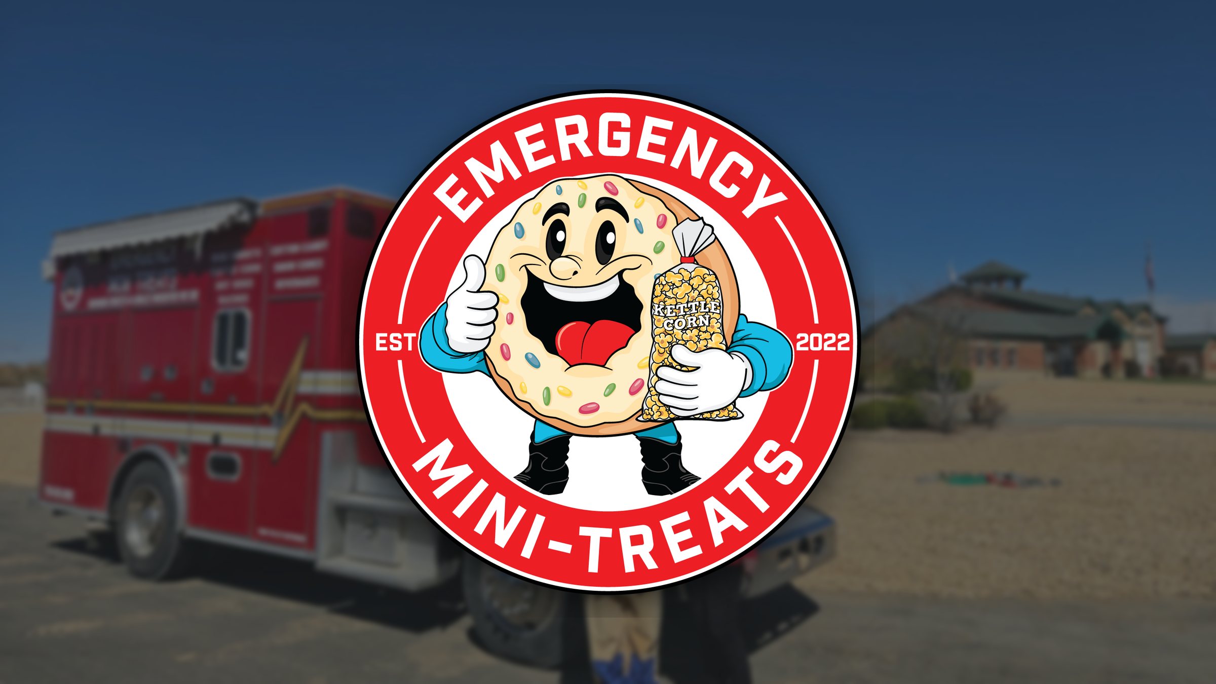
Emergency Mini-Treats is a Northern Colorado treat truck selling mini donuts, kettle corn, cotton candy, and snow cones out of a refurbished heavy rescue fire truck. First responders get a discount, and appreciation for them is the whole point of the business. The truck arrived still wearing a previous owner's "Emergency Treats" graphics, and the business had no logo of its own. The first ideas leaned on what every emergency brand uses: badges, stars, flags, a plus sign. Any of those would have looked official, and none of them would tell a parent at a county fair that this is the truck with the donuts.
We designed a mascot. A grinning, sprinkle-covered donut gives a thumbs up while holding a bag of kettle corn, set inside a bold red seal with the name arched around it. The seal keeps the shape and confidence of an emergency services patch. The character inside makes it friendly enough for a kid to point at. The red was matched to the truck, so the logo and the vehicle read as one brand from across a parking lot. The truck graphics came next. We mapped every panel from photos of all four sides: the logo on the cab doors and the box, the name and the "Bringing Sweets-N-Smiles Wherever We Go!" tagline up high, and the menu on the side compartments where a line forms. The original lifeline heartbeat stripe stayed because it already fit the story. The print shop got press-ready files and a page of production notes. The website carries the same red, the same donut, and a warm halftone dot texture behind each section. The homepage opens on the actual truck, then shows the TV and press features before anyone scrolls. An events calendar the business updates on its own shows where the truck will be next. The menu, the story behind the truck, the calendar, and live Google and Facebook reviews all lead to one booking form. That form asks for the date, the location, and the guest count, which is everything it takes to quote an event.
The logo, the truck, and the site launched as one recognizable brand, and the booking form did its job. Requests came in from community colleges, a high school, a fire department, an aerospace company, and a county fair. Every request shows the size and type of event before anyone calls back. The mascot became the face of the business, on the truck, on the kettle corn bags, and on the site.
“We had no idea what kind of logo we wanted for our food truck. Tannis came up with a professional and whimsical logo, when we saw it we just laughed and said that was exactly what we needed.”
A mascot in place of the badge-and-flag look most emergency-themed brands use. The donut and kettle corn bag sell the menu before anyone reads it.
Logo red matched to the truck's paint, so the mark and the vehicle read as one brand at a distance
Full graphics plan for a heavy rescue fire truck: four sides mapped from photos, with print-ready files and printer notes
Booking form that collects date, location, and guest count, so every request arrives ready to quote
Events calendar the business runs itself: new stops go up from a phone using a step-by-step guide we wrote, so customers always know where the truck will be next